Back
Redesigned website makes PLASP 2.0 mobile-friendly!
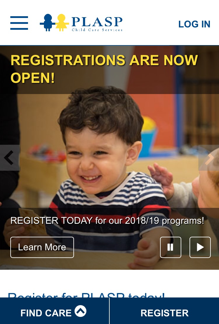
Very early on the morning of February 14th, PLASP was excited to launch PLASP 2.0 – a new mobile-friendly version of the website. Now, parents can do everything on their mobile device - from new registrations, program changes, additions and cancellations to editing their profile information and emergency contacts.
|

PLASP 2.0 – available now on mobile devices.
|
“More than 50% of the visitors to our website use a tablet or a mobile device to do so,” says Lynn Hiebert, PLASP CEO. “It’s important to create an online experience that’s easy to navigate. We know how busy our parents are – they’re on the go, relying often on their phones for their day to day online tasks. Parents want a site that works well for them on every device. And PLASP 2.0 does.”
We designed the new features of PLASP 2.0 as a direct result of parent feedback. In 2015, PLASP began doing focus groups with parents. We wanted to understand how to improve their experience using the PLASP website. (Read our blogs here and here about the focus groups). Parents clearly told us they want a site that is user and mobile friendly.
Based on parents’ insights, we began working on a site redesign. After two years of development, PLASP 2.0 launched.
David Karpiak, Manager, IT Solutions for PLASP, says, “Parents want information faster. They want to interact with PLASP more efficiently. To be a world class provider of early learning and child care, we need to consider the myriad of ways parents may interact with PLASP online. We evolved to meet parents’ needs through newer, better, and faster technology.
The PLASP website offers full online registration for more than 12,000 families and 1600 programs across the GTA and has evolved to allow parents to have information at their finger tips. It’s a far cry from 17 years ago, when registrations were done on paper and in schools. Parents recalled lining up at their children’s school at 5am to register their children for PLASP programs. With online registration and the mobile-friendly version of the website, parents can now register for programs from the comfort of their homes and using their phones.
|

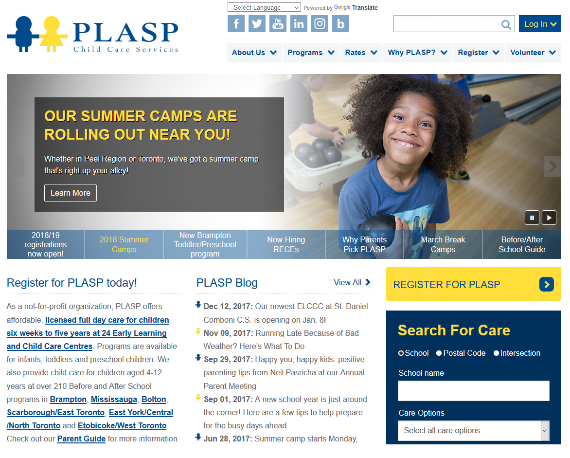
PLASP 2.0 – desktop version. A rotating, interactive photo banner on the home page allows parents to find the content they need more easily.
|
“Busy parents don’t always have the luxury of sitting down at a desktop to do things like update registrations or read news,” says Dave, a PLASP parent and father of two. “Often, we’re doing those things on our phones while we wait for our children at extracurricular activities. Being able to login to my family profile on plasp.com using my phone is really helpful. I feel like PLASP is listening to what we need as parents and that’s really appreciated.”
Share your feedback
As always, we love to hear feedback from our PLASP parents about their experience using the website – what they love and areas in which we can make improvements. Leave your comment below or send us an email at communications@plasp.com and let us know your thoughts
Want to know more?
Below are some key points in the evolution of PLASP’s website since its inception 17 years ago:
-
November 2001: The first version of plasp.com launched.
-
2008: PLASP surveyed parents about their usage of the website. 74% of parents surveyed indicated that they were using the internet daily for tasks like shopping, research, internet banking and email.
-
2010: The look and feel of the website was upgraded.
-
2011: The organization made the decision to move in the direction of online registration.
-
March 2013: The new website went live and online registration for PLASP programs began.
-
July 2015: Parent focus groups were held.
-
February 2018: PLASP 2.0 launched.
|

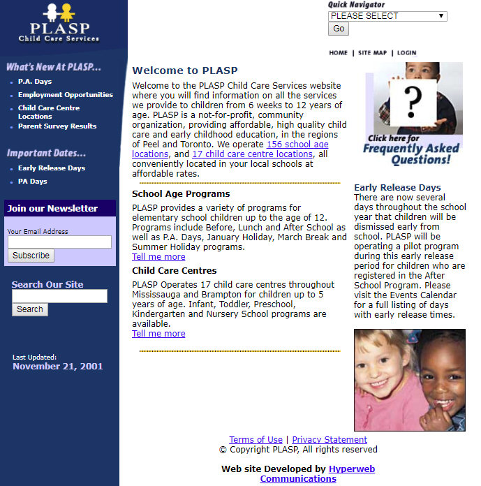
Above: The first version of the PLASP
website when it launched in 2001
|
|

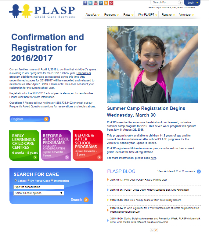
Above: In 2013, the blue login button in the right hand corner of the website changed the way parents registered for PLASP programs. |
PLASP Child Care Services